Dialogs
Table of Contents
Introduction
The EPiServer user interface uses dialogs in many place in order to communicate additional information or perform tasks within the current view. This documentation will look into the implementation of the dialogs within EPiServer and their recommended pattern for use.
Available Dialogs
Alert
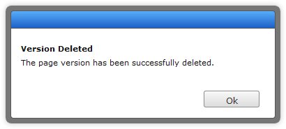
The Alert dialog is intended to display information to the user which they need to acknowledge and are not required to perform any decision on. For example, when a page version is successfully deleted, we can display an alert which tells the user that the operation was successful.
 CopyJavaScript
require(["epi/shell/widget/dialog/Alert"], function (Alert) {
    var dialog = new Alert({
        heading: "Version Deleted",
        description: "The page version has been successfully deleted."
    });
    dialog.show();
});
Confirmation
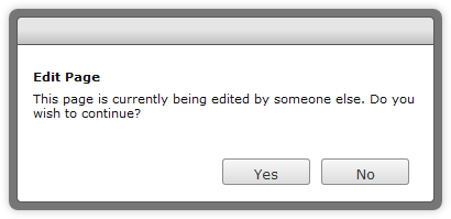
The Confirmation dialog can be used to display information for which the user must make a decision about. For example, if a user wishes to edit a page which has been locked for editing by someone else, we can display a confirmation which asks if they are sure they wish to continue.
CopyJavaScriptrequire(["epi/shell/widget/dialog/Confirmation"], function (Confirmation) {
var dialog = new Confirmation({
heading: "Edit Page",
description: "This page is currently being edited by someone else. Do you wish to continue?"
});
dialog.show();
});
Standard
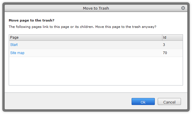
The standard Dialog can be used to display custom content. It is recommended that you create a widget that displays and manages the business logic of the component and simply use the standard dialog as a display container. For example, if a user wishes to delete a page which has other pages linking to it, we can display a standard dialog with a widget that contains information about linked pages.
CopyJavaScriptrequire([
"epi/shell/widget/dialog/Dialog",
"example/widget/LinkedPages"],
function (Confirmation, LinkedPages) {
var dialog = new Dialog({
title: "Move to Trash",
heading: "Move page to the trash?",
description: "The following pages link to this page or its children. Move this page to the trash anyway?",
content: new LinkedPages()
});
dialog.show();
});
Callbacks
All of these dialogs have a very simple callback interface for when actions occur. The alert and confirmation dialog have only one callback, this is onAction. In the case of alert this simply indicates that the dialog has been acknowledged. In the case of the confirmation dialog the callback has a boolean parameter which indicates if the dialog was confirmed (true) or canceled (false). For example:
CopyJavaScriptrequire(["epi/shell/widget/dialog/Confirmation"], function (Confirmation) {
var dialog = new Confirmation({
description: "This page is currently being edited by someone else. Do you wish to continue?",
title: "Edit Page",
onAction: function (confirmed) {
if (confirmed) {
/* Change view to edit mode */
}
}
});
dialog.show();
});The standard dialog uses the Dojo API for issuing callbacks; the confirm action causes an onExecute and the cancel action causes an onCancel. It is recommended that you read the Dojo dialog documentation before connecting to or overriding either of these events.
Action Labels
Sometimes the default labels for the actions may not be what is required. This can be quite easily customized when constructing the dialog. Each dialog has properties which define the labels to be displayed. For the alert dialog it is acknowledgeActionText and for the confirmation and standard dialogs they are confirmActionText and cancelActionText. There are common action labels localized in epi.resources.action .
Changing Available Actions
When using the standard dialog, there are some scenarios in which the widget being displayed needs to add additional actions to the action pane; a provider and consumer pattern has been implemented to facilitate this in a decoupled fashion. The standard dialog is an epi.shell.widget._ActionConsumer and your widget, shown inside the dialog, simply needs to implement the epi.shell.widget._ActionProviderWidget and supply its actions using the addActions method.
CopyJavaScriptrequire([
"dijit/layout/_LayoutWidget",
"epi/shell/widget/dialog/Dialog",
"epi/shell/widget/_ActionProviderWidget"],
function (_LayoutWidget, Dialog, _ActionProviderWidget) {
var MyActionProviderWidget = dojo.declare("example.widgets.MyActionProviderWidget", [_LayoutWidget, _ActionProviderWidget], {
startup: function () {
this.inherited(arguments);
this.addActions({
name: "hello",
label: "Say hello",
iconClass: "buttonClass",
action: dojo.hitch(this, function () {
this._sayHello();
})
});
},
_sayHello: function () {
console.log("Hello!");
}
});
var providerWidget = new MyActionProviderWidget();
var dialog = new Dialog({
content: providerWidget
});
dialog.show();
});It is also possible to register a provider with a consumer manually, by supplying it to the constructor arguments of the consumer.
CopyJavaScriptrequire(["epi/shell/widget/dialog/Dialog", "epi/shell/widget/_ActionProvider"], function (Dialog, _ActionProvider) {
var MyActionProvider = dojo.declare("example.MyActionProvider", [_ActionProvider], {
getActions: function () {
return [
{
name: "hello",
label: "Say hello",
iconClass: "buttonClass",
action: dojo.hitch(this, function () {
this._sayHello();
})
}
];
},
_sayHello: function () {
console.log("Hello!");
}
});
var provider = new MyActionProvider();
var dialog = new Dialog({
content: "Some dialog content.",
actionProviders: [provider]
});
// Act
dialog.show();
});If you do not have any use for the default dialog buttons, they can be removed setting defaultActionsVisible to false when constructing the dialog.
Changing the State of Actions
If the state of an action has to be changed during the lifetime of a dialog, for instance enabling or disabling an action, this is done by calling _ActionProvider.setActionProperty().
CopyJavaScript<script type="text/javascript">
require(["dojo", "dijit/_Widget", "epi/shell/widget/dialog/Dialog", "epi/shell/widget/_ActionProviderWidget"],
function (dojo, _Widget, Dialog, _ActionProviderWidget) {
// Implement a widget inheriting the action provider widget
var MyActionProvider = dojo.declare("example.MyActionProvider", [_Widget, _ActionProviderWidget], {
startup: function () {
this.inherited(arguments);
// Add an action to the dialog toolbar
this.addActions({
name: "disableme",
label: "Click to disable",
action: dojo.hitch(this, function () {
// When the action is executed we disable this action
this.setActionProperty("disableme", "disabled", true);
})
});
}
});
var dialog = new Dialog({
content: new MyActionProvider()
});
dialog.show();
});
</script>Last updated: Mar 21, 2013