File Summary Configuration - EPiServer Connect for SharePoint
|
Product version: |
EPiServer Connect for Sharepoint version 2.2, 2.2 SP1 and 2.4 |
|---|---|
|
Document last saved: |
Introduction
This tech note describes how todefine a separate File Summary configuration for each virtual path provider using the customFileSummary parameter when developing with EPiServer Connect for SharePoint.
The EPiServer Connect for SharePoint module contains a custom file summary (WSSFileSummary.config) for the virtual path provider with SharePoint specific field definitions, it can be found in the root folder of the EPiServer CMS Web site.
By using the file summary configuration file the user can define which properties should be available for edit and advanced search functionality for this virtual path provider. Users can only use the following SharePoint data types:
- Single line of text
- Multiple lines of text
- Choice (menu to choose from)
- Number (1, 1.0, 100)
- Date and Time
- Yes/No (check box)
Edit Meta data configuration
The form for Meta data editing can be configured in the FileSummary.config file - an XForms file with HTML markup and XForms data fields. The list of data fields declared in the model/instance section is as follows:
<model>
<instance>
  <Title />
  <TestText />
  <TestChoice />
  <TestRadio />
  <TestCheckBox />
  <TestTextArea />
  <TestBool />
  <TestDate />
  <TestNumber />
 </instance>
</model>
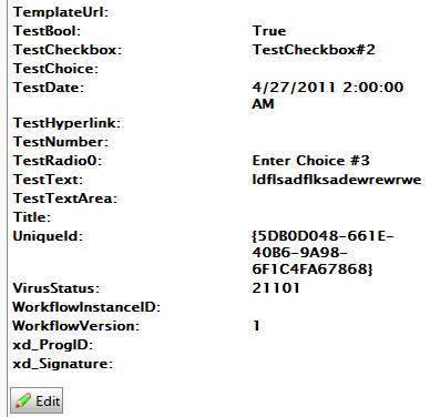
The data fields is a Microsoft SharePoint internal property ID and is autogenerated from the field name. To find out the ID right click on the file in File Manager and select Show File Summary, in the displayed view in a left column you can find all file properties ID:

Each data type can be represented by different xforms controls. Reference to the data field should be declared in the ref control attribute. Here are examples of controls for different data types:
- Simple text string:

<xforms:input ref="TestText" value="" id="fieldTestText" size="40" class="commonInput" /> - Exclusive choice with drop-down list:

<xforms:select1 appearance="minimal" ref="TestChoice" id="fieldTestChoice" >
 <xforms:item>
  <xforms:label>Choice #1</xforms:label>
  <xforms:value>Choice #1</xforms:value>
 </xforms:item>
 <xforms:item>
 <xforms:label>Choice #2</xforms:label>
 <xforms:value>Choice #2</xforms:value>
 </xforms:item>
 <xforms:item>
 <xforms:label>Choice #3</xforms:label>
 <xforms:value>Choice #3</xforms:value>
 </xforms:item>
</xforms:select1>
Note! xforms:value tag content should correspond to the choice value specified in document library column settings.
- Exclusive choice with radio buttons:

Controls tag is almost the same as in previous sample, the only difference is appearance attribute, it should be:appearance="full"
Note! SharePoint data field with a ‘Fill-in’ choice are not supported and cant be displayed. - Multiple choice with checkboxes:

<xforms:select appearance="full" ref="TestCheckBox" id="fieldTestCheckBox" >Note! xforms:value tag content should correspond to the choice value specified in document library column settings.
<xforms:choices>
<xforms:item>
<xforms:label>CheckboxChoice#1</xforms:label>
<xforms:value>CheckboxChoice#1</xforms:value>
</xforms:item>
<xforms:item>
<xforms:label>CheckboxChoice#2</xforms:label>
<xforms:value>CheckboxChoice#2</xforms:value>
</xforms:item>
<xforms:item>
<xforms:label>CheckboxChoice#3</xforms:label>
<xforms:value>CheckboxChoice#3</xforms:value>
</xforms:item>
</xforms:choices>
</xforms:select>
Note! SharePoint data fields with a ‘Fill-in’ choice are not supported and can not be displayed. - Multiline input (text area):

<textarea ref="TestTextArea" id="fieldTestTextArea"></textarea> - Single check box (for Boolean values):

<xforms:select ref="TestBool" id="fieldTestBool" appearance="minimal">
 <xforms:choices>
<xforms:item>
<xforms:label>Test Bool</xforms:label>
<xforms:value>True</xforms:value>
</xforms:item>
 </xforms:choices>
</xforms:select> - Dates or numeric values:

<xforms:input ref="TestText" value="" id="fieldTestText" size="40" class="commonInput" />Note that the tags are identical as for the simple text string values.
