Working with complex layouts
Introduction
Many interfaces in Commerce Manager contain different lists, toolbars and custom user controls. For customizing these UI types we use the special XmlFormBuilder control. In the XmlFormBuilder XML it is possible to define layouts and predefined properties for controls.
Complex layout examples
Below are some examples of complex layouts and their components.
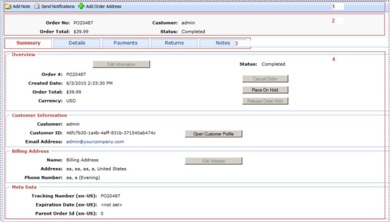
The example below shows:
- Block1 – toolbar (Section Form/Toolbars)
- Block 2 – first Form/Block in XML
- Block 3 – list of all blocks in the form of tabs
- Block 4 – list of controls defined in XML, for selected block (tab)
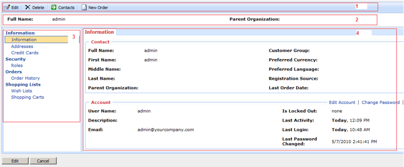
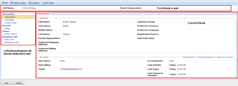
The example below shows:
- Block 1 – toolbar (Section Form/Toolbars)
- Block 2 – first block in section Form/Block in XML
- Block 3 – list of all blocks in the form of menu
- Block 4 – list of controls defined in XML, for the selected block
The example below shows:
- Block 1 – toolbar
- Block 2 – one of the layout blocks
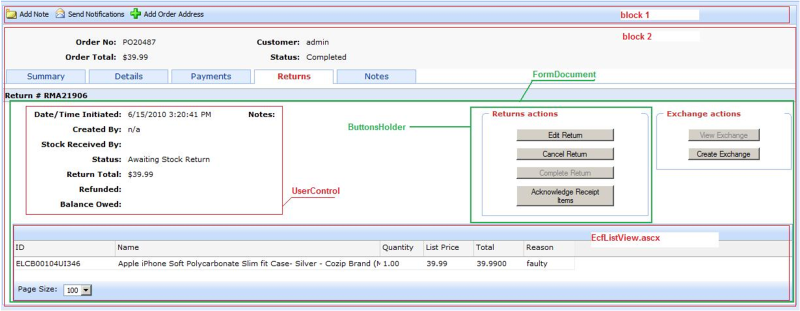
The current view is defined in two XMLs: PurchaseOrder-ObjectView.xml section View/Layout, and in PurchaseOrder.[MC_BaseForm].xml section in View/FormDocument.
- Block 1 can be customized in the View/Layout/Toolbars section.
- Common view of the second block, in the current case there is the FormDocumentView control with predefined properties for getting data from PurchaseOrder.[MC_BaseForm].xml.
- ButtonsHolder is defined from the first XML at the View/Layout/ButtonSets section.
- Columns for EcfListView are defined in the first XML in the View/Layout/Grids section.
In the following we will modify tabs in Views for XmlFormBuilder. In all the examples below we need to create a file with the name PurchaseOrder-ObjectView.xml in the ~/%AppName%/Config/View.
Adding a tab to OrderView
Here we will add a new tab with the name "NewBlock" and add a control ~/Apps/TestApp/TestControl.ascx with one pre-defined property.
<?xml version="1.0" encoding="utf-8" ?>
<View xmlns="http://schemas.mediachase.com/ecf/view">
<Form>
<Layout>
<add>
<Block id="test" name="NewBlock">
<Placeholder id="Placeholder_1">
<Control id="testControl" path="~/Apps/TestApp/TestControl.ascx">
<Property name="Property1" value="Value1" />
</Control>
</Placeholder>
<Placeholder id="Placeholder_2">
</Placeholder>
<Placeholder id="Placeholder_3" />
<Placeholder id="Placeholder_4" />
</Block>
</add>
</Layout>
</Form>
</View>
Modifying tabs in OrderView
Here we replace the control "/Apps/Order/Modules/ShortInfo.ascx" with the user control from our "/Apps/TestApp/NewShortInfo.ascx" application.
<?xml version="1.0" encoding="utf-8" ?>

<View xmlns="http://schemas.mediachase.com/ecf/view">
<Form>
<Layout>
<Block id="Null" name="">
<Placeholder id="Placeholder_1">
<Control id="GeneralInfoCtrl1" path="~/Apps/Order/Modules/ShortInfo.ascx">

<setAttributes path="~/Apps/TestApp/NewShortInfo.ascx" />

</Control>
</Placeholder>
<Placeholder id="Placeholder_2">
</Placeholder>
<Placeholder id="Placeholder_3" />
<Placeholder id="Placeholder_4" />
</Block>
</Layout>
</Form>
</View>
Deleting a tab in OrderView
In this example we will delete the last tab "Notes" from OrderView.
<?xml version="1.0" encoding="utf-8" ?>
<View xmlns="http://schemas.mediachase.com/ecf/view">
<Form>
<Layout>
<remove nodeId="notes"/>
</Layout>
</Form>
</View>
XML description
Block can have the following attributes:
- id – unique identifier in XML scope
- name – block name
Placeholder can have the following attributes:
- id – unique identifier in XML scope
Control can have the following attributes:
- id – unique identifier in XML scope
- path – relative path to the user control
Property can have the following attributes:
- name – name of the public property
- value – value for binding the current property
XmlFormBuilder properties
LayoutMode describes how to display blocks:
- Default – all blocks will display "as is".
- WithTabs – all blocks except the first one, will display under tabs (see image).
- LeftMenu – all blocks except the first one, will display as LeftMenu navigation (see image).
- JQueryMode – same as "WithTabs", except that Tab changes to process without postback (so called client tabs).
Last updated: May 28, 2015