Customizing the toolbar
Introduction
The Toolbar is a set of buttons, menus, and text with structure and action commands defined in XML. We will describe how to modify toolbar items by using the top menu as an example.
Adding a toolbar item
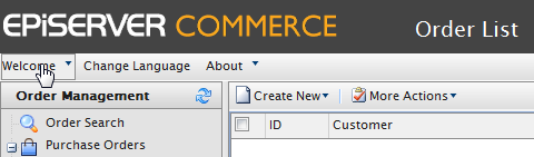
In this example we will add a new item to the "Welcome" menu on top of the page. To do this you will need to create the file "TopMenu.xml" in the ~/Apps/(ModuleName)/Config/View folder.
<?xml version="1.0" encoding="utf-8" ?>
<View xmlns="http://schemas.mediachase.com/ecf/view">
<ListViewUI>
<Toolbar>
<Menu id="CreateMenu" text="\{SharedStrings:Welcome\}">
<add>
<Button id="MyTestButton" text="TestButton" imageUrl="~/Apps/Shell/styles/Images/Shell/exit.gif" commandName="TestCommand"></Button>
</add>
</Menu>
</Toolbar>
<Commands>
<add>
<Command id=" TestCommand">
<CommandType>ClientAction</CommandType>
<ClientScript>alert('test command');ClientScript>
</Command>
</add>
</ListViewUI>
</View>
Modifying a toolbar item
In this example we will change the "Sign Out" text in the same menu.
<?xml version="1.0" encoding="utf-8" ?>

<View xmlns="http://schemas.mediachase.com/ecf/view">
<ListViewUI>
<Toolbar>
<Menu id="CreateMenu" text="{SharedStrings:Welcome}">
<Button id="SignOutBtn" text="{ShellStrings:Sign_Out}" imageUrl="~/Apps/Shell/styles/Images/Shell/exit.gif" commandName="ECF_Top_SignOut">
<setAttributes text="New SignOut Text"></setAttributes>
</Button>
</Menu>
</Toolbar>
</ListViewUI>
</View>
Removing a toolbar item
In this example we will remove the "Sign Out" button in the menu.
<?xml version="1.0" encoding="utf-8" ?>
<View xmlns="http://schemas.mediachase.com/ecf/view">
<ListViewUI>
<Toolbar>
<Menu id="CreateMenu" text="{SharedStrings:Welcome}">
<remove nodeId="SignOutBtn" /
</Menu>
</Toolbar>
</ListViewUI>
</View>
XML description
You can add the following elements to the toolbar:
- Text
- Splitter
- Button
- Menu
- SplitButton
Note that if the XML contains an unsupported element, the exception NotSupportedException will be thrown.
Toolbar attributes
- id - unique identifier within XML.
- text - element label (button, menu etc).
- imageUrl - element icon (only used for Menu, SplitButton, Button).
- cssClass - element stylesheet css class.
- align - element location (can be Left, Right). The default value is left.
- handler - client handler which is called when element is clicked; the client method name must be specified; the element object will be passed as a parameter to the client method.
- commandName - server command; enableHandler of that command will determine if element is visible or not.
- itemSplitter - added to a Splitter element, can have the following values:
- None (default) - separator is not added.
- Left - separator is added to the left of the element.
- Right - separator is added to the right of the element.
- Both - separator is added on both sides of the element.
- tooltip - define element tooltip.
- permissions - text parameter passed to the enableHandler for the command.
Do you find this information helpful? Please log in to provide feedback.
Last updated: May 28, 2015